Return to Neverland

panfin
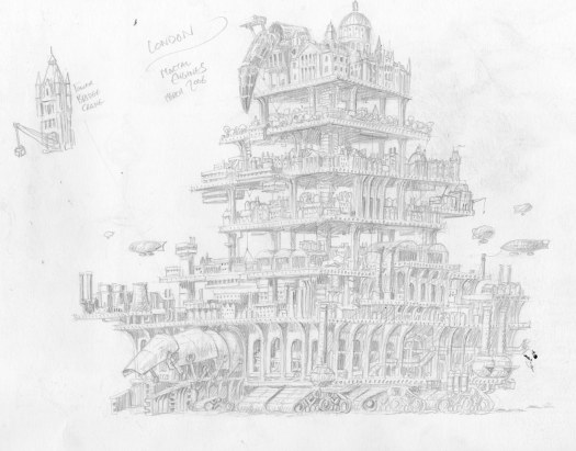
Back in 2006 I received a call from Molly Dallas, then Art Director of OUP children’s books. She had an interesting and important job for me, but I had only ten days to complete it. Brian Froud had been involved in painting the cover, but there had been a bit of a falling out and he left the project. At the time I was in possession of fully functioning eyeballs and could work quite long hours if required, so I said yes to the mission. Brian’s original cover hangs in my friend’s (Todd and Carol) house, a stone’s throw from where I’m typing this, guarded round the clock by a Pointer dog. Brian had used their son as a model, hence its current location. You can Google it to get a better look…

DSC_0001

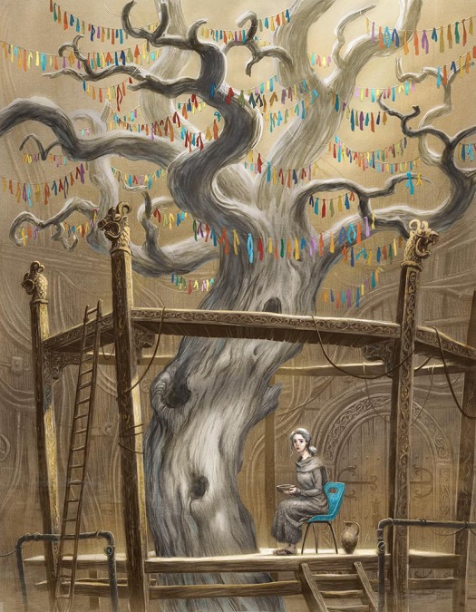
Todd and Carol had met the Frouds when working on Jim Henson’s Labyrinth, and their house is filled with props and art related to the film, along with various eminent local mythic artist’s work, even my own (here I am painting a massive tree mural in their kitchen).

_1090002

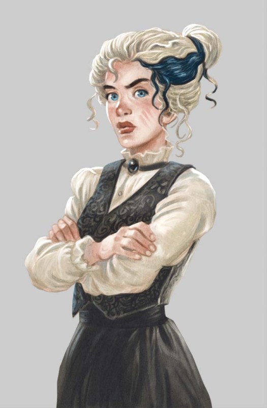
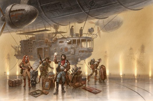
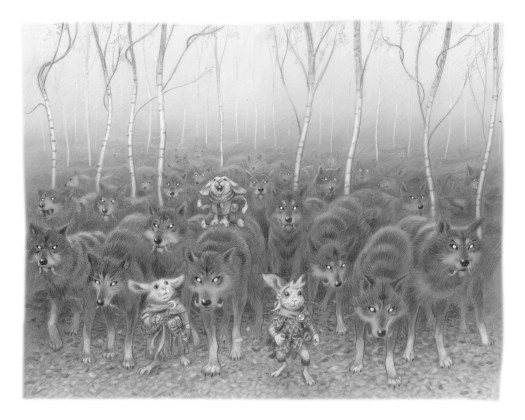
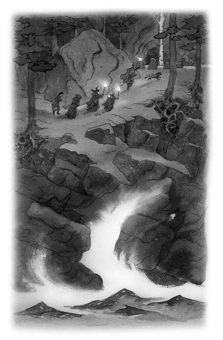
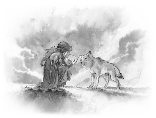
The job involved the first official sequel to JM Barrie’s Peter Pan, written by Geraldine McCaughrean. Barrie had bequeathed the ownership of his work to Great Ormond Street Hospital in the 1920’s; due to some terribly complicated rights issues that are too tedious to go into here, the Hospital decided to commission a follow-up story.

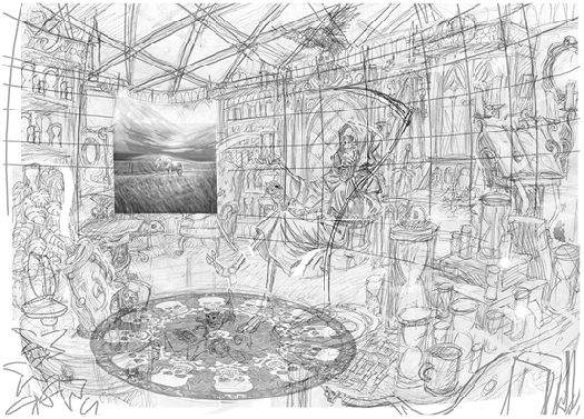
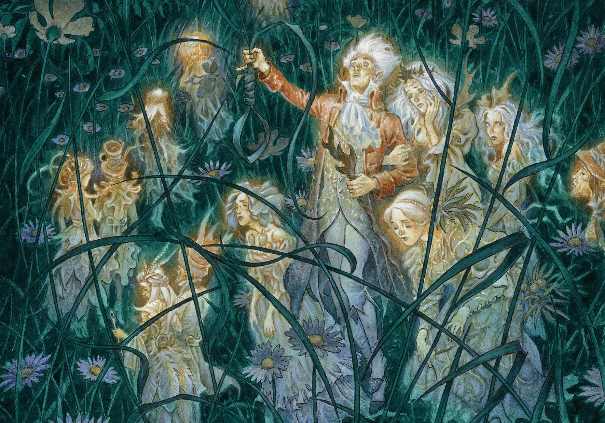
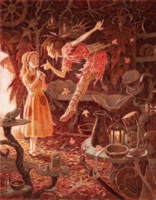
I seem to remember the cover being completed very quickly; here’s the only rough I can find in the archive. The title had already been designed by master typographer Stephen Law, which proved very helpful to me in deciding the basic layout. As a homage to Brian I was keen to get a multitudinous swoosh of Fairies in there, though in the final art they lost their rainbow colours.

pan1

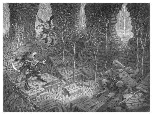
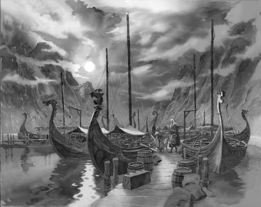
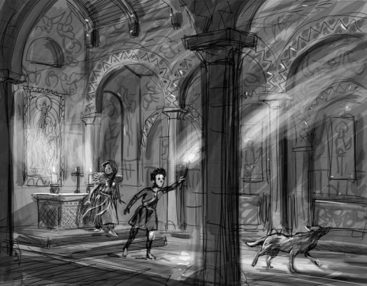
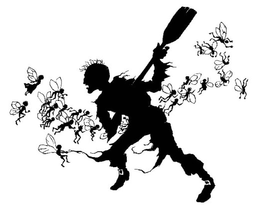
As well as the cover, a number of chapter heading illustrations were required. To save time I thought it would be nice to make silhouettes, reflecting the illustrations of Rackham and Co. that were prevalent around Barrie’s time. Unfortunately, having little experience with pure silhouettes before, I completely underestimated how difficult they would be to produce. I tend to rely on exciting angles and perspective to add drama to my illustrations, and suddenly those tricks are rendered null and void in the flat-lands of the shadow image.

pansil23

Anyway, the job was completed in time and the book launched in a spectacular, celebrity packed event at Kensington Palace in October 2006. Shortly after that I was commissioned to illustrate the original Peter Pan novel in a similar style, and then Geraldine adapted her story for a picture book version, published in 2008…

insidehook

pp1

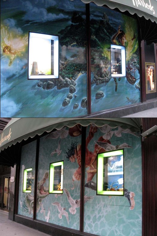
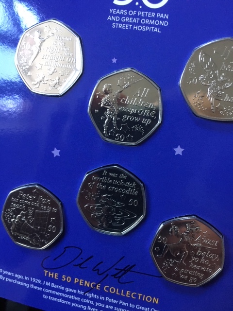
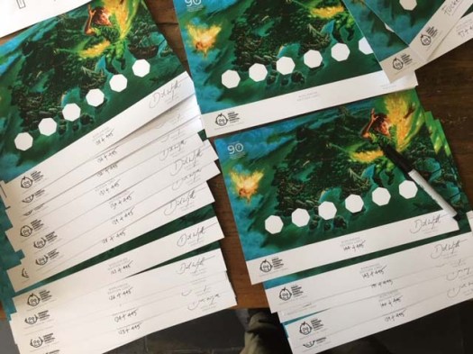
Since then, the images (both fully painted and silhouetted) have been used in a staggering amount of merchandise licensed by Great Ormond Street, including jigsaws, chinaware, Christmas decorations and now some of the silhouettes have been re-imagined onto 50p coins… I had to do a bit of remedial work to fit the Royal Mint’s requirements, but the hard graft came in signing several hundred special presentation packs. It’s surprisingly difficult to keep sane whilst repeating a signature over and over.

IMG_0935IMG_0854

So thanks to Mr Froud for inadvertently opening a doorway to Neverland for me! Here he is a few weeks back sitting at the other end of the kitchen I mentioned earlier, with Todd and Carol (patting Tilly the Wonderdog, whose owner, Terri Windling is hidden behind Alan Lee).

IMG_0738


Uki and the Outcasts

ua

Podkin takes a rest in Kieran Larwood’s latest book, but we are very much in the same rabbit-centric universe.

Here are a few illustrations, interspersed with some ‘in progress’ examples. As usual, once the roughs are approved, I start the drawing with a cheap H pencil, and gradually build up the tones using increasingly dark (and expensive) pencils. You can see three of my Blackwings in the picture below but I rarely use the softest one. Once applied, attempts to erase mistakes inevitably lead to a smudgy mess.

u2

Once I’ve penciled as much as I dare, I scan the drawing and improve the contrast in Photoshop, adding some highlights where necessary.

u1

uc

IMG_0350

As per previous Podkin books, I like to get in as much tree action as possible…

ub

ud

uki3

I was too scared to add the fiery splatter around the sprite on the actual drawing, so I cheated by making some separately and overlaying it digitally.

ue

Despite its apparent simplicity, the above picture proved tricky as the middle of the spread (known as the gutter) cuts out at least an inch of the image. I had to do a lot of experimenting at the rough stage to balance it properly. Despite that, I look at it now and can see that the central birch sapling should have been moved slightly to the left as it will most likely become hidden in the finished book.

jerb

Uki and the Outcasts is published by Faber & Faber in the U.K. in September 2019.

It’s got giant Jerboas in it!

For in that Journal of Death, what dreams may come…

ratsandcheesefin2

The Death of Rats was the first thing I illustrated for Terry Pratchett. He appeared on the 2001 hardback edition of The Amazing Maurice and his Educated Rodents, with a more sinister, spectral aspect than I would paint nowadays (see below; the top one is new).

rats

The rest of the cover was a bit of struggle as the manuscript was unfinished at the time but, as is the way with publishing, an image was needed far in advance of publication. Eventually, a suitable approach was approved and Terry was kind enough to phone and thank me for my efforts, a lovely gesture that illustrates what a considerate chap he was.

IMG_0726

Having completed the Death’s Study jigsaw for the Discworld Emporium, I recently did some illustrations for the accompanying journal. Here are a few examples…bookplate1

Ysabell, later to become wife of Mort and mother of…

yssabel

…Susan Sto Helit.

susan2

Here’s Death enjoying himself a little too much at Hogswatch.dhogfatherdeathonbikefin

Death and Binky.ddeathonbinkyfin2

Death’s manservant, Albert.

albertfin2

The journal is published by Gollancz early August. Visit the Discworld Emporium to get your copy!

Way of the Waves

port

The sequel to Riddle of the Runes by Janina Ramirez is out next week, so here are some illustrations and behind-the-scenes thingies.

Having developed a line and wash technique for the first book, I was obliged to stick with a similar approach. It involves drawing on very rough and heavy watercolour paper with a Faber-Castell Pitt Pen, splodging it with water and then dropping diluted Indian ink onto the appropriate areas in the hope that interesting effects transpire.

Stage one for each picture begins with a rough…

1

Then a pencil outline is drawn onto the watercolour paper…

IMG_0399 copy

Once the line work is done, on goes the water. I try to keep it away from areas I want to keep light (like the moon).

IMG_0401

Once the Indian ink is applied, it’s time for a spell of drying time in front of the fire…

IMG_0408

One of the pleasant aspects of working in this style is watching the watery ink create its own shapes and textures. I can control it a little by adding darker blobs or dabbing some away if things get out of hand, and if it gets really messy a cheeky tweak in Photoshop will get me out of trouble. Also, before it dries, the ink has a lovely sepia tone which gives the paintings a sense of depth whilst the work is in progress. You can see the effect on this tree’s shadow…

IMG_0490

Here’s a rough of the interior of the Anglo Saxon York Minster. Much research was needed before I could confidently reflect the architecture and decorative elements of this long-lost building.

c10

Here it is finished…

9

Some images required more detailed roughs before I could plunge into the finished illustrations. Once again, I spent a lot of time finding out about costumes, musical instruments, buildings, market stalls and everything else that made up life in a 10th century Anglo Saxon town.

town

img837

Lastly, a smattering of other pictures from the book…

14

6

2

Way of the Waves is out July the 4th…

51L+BVKHL3L

Developing the Drum

IMG_0606

For the third Discworld Emporium Jigsaw, it was decided that a visit to the Mended Drum was in order.

What follows is an overview of how the picture developed, featuring some of the original briefs and sketches. It’s hard to convey how tricky the whole thing was, which is annoying as everyone says it’s much easier to do as a puzzle compared to the previous ones. I was rather hoping any prospective puzzlers would endure a similar distress to what I experienced while painting it (in an altruistic way of course – no pain, no gain, etc.) hopefully leading to a more satisfying jigsaw experience.

As usual, Ian at the Emporium started the drum rolling by sending me a sketch along with notes on what he was looking for.

1

I batted a sketch over, the most significant change being the viewpoint, which I found needed to be higher up in order to accommodate all the characters clearly.

2

Ian whacked a sketch right back, suggesting we needed to zoom out from the scene to fit in more characters. Ian is a scoundrel and knows my Achilles Heel: a deranged adherence to the ‘More is More’ doctrine, despite the fact that it usually means twice as much work for me.

3

After this scene was decided, I started building the architecture of the pub and bending the perspective (almost to breaking point) so the Drum customers would appear to inhabit the space in a believable manner.

4

Once this rough was complete, work could really start… but there were lots of little changes to be made before I moved onto the finished piece. You can read Ian’s version of events on the Discworld Emporium Blog.

5

IMG_0601

There will be another puzzle released later this year (the subject is currently a closely guarded secret but it was my favourite to do so far) and I’m currently working on a 5th (and possibly 6th). Check out the Discworld Emporium for future announcements…

Larklight Rising

l1

Due no doubt to Mr Reeve’s literary success and the recent interest in his excellent Mortal Engines books, Larklight has been reissued with yet another cover. Here is a recap of what can be expected within its Victorian-suffused pages…

Marvel as the full force of the law is brought down upon alien miscreants…

l151

Ponder the intricacies of gravity-independent architecture…

l4

Meet interesting characters from the farthest reaches of the Empire…

l206

Experience travel in exotic locations…

l46

Expand your knowledge of the universe beyond…

l18

Be exposed to comment in a medical institution…

l130.jpg

Circumnavigate Jupiter in style…

l211

Sail into spider-infested asteroid fields with space-pirates…

l269.jpg

Sadly, the new edition has dispensed with the adverts that appeared at the beginning of the previous editions, which is a shame as they set the tone of the book quite nicely. But here they are now…

JE01_A2P2.indd

Back in (tr)Action (cities)

Congratulations to me for the most convoluted Blog title I’ve managed so far.

But it is appropriate as this is all about the new Illustrated World of Mortal Engines book.

IMG_0109

I first sketched Philip’s monstrous London back in 2006 when we were working on Larklight. Shortly after, I designed an ambitious cut-through cover for the 2008 re-issue (which booksellers hated as the paperback versions tended to get damaged easily).

img609

IMG_0108

As well as applying this treatment (inspired, I suspect, by my love of early 1970’s prog-rock album covers) to the original Quartet, there was a lovely, chunky hardback for Fever Crumb, the first of the prequels (2009).

IMG_0110

At the time there was much excitement as Peter Jackson had acquired the rights to film the book and was already tinkering away in New Zealand on digital traction cities. As is often the case with films, the project went into limbo for a good while, but is now completed and due out this Christmas.

For the Illustrated World of Mortal Engines, Philip has worked with Jeremy to flesh out the history of the Traction Era; the book is jam-packed with paintings and diagrams and character sketches by a number of artists. Here a few of my contributions…

airhavenfin

Airhaven

13thfin

The 13th Floor Elevator (featuring Thaddeus Valentine)

amazonefin2

The Amazone

cloutietreefin

The Cloutie Tree from Fever Crumb

I was round at the Reeve’s the other day signing 300 bookplates for a special edition. I’m not sure how you can get hold of one of these at the moment, but keep an eye on Philip’s website as I imagine more details will be forthcoming…

IMG_0069

Death, The Undiscovered Study

DeathsstudyFIN

Here’s another terminally frustrating puzzle from Terry Pratchett’s Discworld Emporium. Despite being an entity most people would choose to avoid, Death remains a very popular character and so I was commissioned to bring Him to life in jigsaw form.

Rather like the previous Library puzzle, Death’s home exists in a place where time and space are a bit… bendy. This entails all sorts of perspective-based challenges for the unsuspecting illustrator. Here are some of the stages, from initial concept to workings-out and then a GIF to show how the painting was constructed.d1

d3 2.jpgd3.jpg

Deathlayers.gif

I hope that GIF works – I made it late on Sunday assisted by a nice bottle of Malbec so if it displays on your chosen digital content provider, I will be a surprised yet happy bunny.  I’m aiming to show that the picture was built in layers so I could move things around if needed (it was needed) ensuring that every piece of the jigsaw had something of interest whilst making a satisfying picture. It’s a tonal (greyscale) study that I would later paint over in digital colour once everything was deemed tickety-boo.

Here’s the box cover – after all that eye boggling warped perspective it was good to indulge in some flamboyant Art Nouveau-flavoured morbidness.

TGUK-book box template

Death’s Study is available from the Discworld Emporium.

Talking of Pratchett-based endeavours, Neil Gaiman was recently in the UK overseeing the production of the Good Omens TV series. Here he is at the launch of my recent book with Janina Ramirez, Riddle of the Runes.

ng

As this post is all about Death, it occurred to me that if I got run over by a tractor or squished by a falling tree (both eminently likely occurences) this photo would be apt as Neil was the first writer I illustrated professionally and (should an unfortunate event befall in the next few weeks) Janina would be the last…

Podkin Part Three

Podkin3forest

September sees the release of the latest instalment of Podkin’s adventures. Here are a few of the illustrations…

trees

I have some posh new pencils to help me do the drawings…

pp

They are called Blackwing and only come in three grades. In fact, they are so posh, they arrive unsharpened, as if the mere act of putting a point on them would render them common. They make me feel like an illustrative version of Nigel Tufnel.

123

102

Here’s the wraparound cover for the U.S. hardback edition, minus all the titles and text and everything…

p3USfin2

The Beasts of Grimheart by Kieran Larwood is released on the 6th September in the UK.

img578


A Crone for Christmas

Or, if you like, an Old Seer for the New Year.

a

This Yuletide I was mostly drawing Vikings for Janina Ramirez, who has written her first children’s book. You can find out what Janina normally gets up to here.

The deadline was particularly aggressive, so I took the chance to experiment with what I like to call my ‘rough’ style, which is supposed to be speedier than usual. The idea is to do quick, minimal line drawings and let the diluted indian ink do most of the work. Sometimes this worked out; for example the smokey atmosphere around the Crone was done in one watery daub, and likewise below, the crashing waves. Unfortunately I had to spend a lot of time fixing things in Photoshop when I’d drawn a nose in the wrong place or the tone had bled into places it shouldn’t and various other speed-related horrors.

e

Anyway, they’re all finished now – these are just a few of the thirty or so illustrations from Riddle of the Runes (out in May!).

d

c

b